ButtonUserMenu
Overview
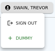
Button that once clicked will open a menu to display user-focused options including Sign out This can be used as a separate component, however it is also part of the AuthWrapper component
NOTE : This is a new component and so will need to be expanded
Tip
The component has been provided all the defaults needed to work within a standard SKA application.
import { ButtonUserMenu } from '@ska-telescope/ska-login-page';

...

<ButtonUserMenu />
Property |
Type |
Required |
notes |
|---|---|---|---|
ariaDescription |
string |
No |
Used by Screen Readers |
color |
string |
No |
Default : ButtonColorTypes.Inherit |
label |
string |
No |
Set to the username |
onClick |
Function |
No |
Determines action(s) to be taken when the button is clicked |
testId |
string |
No |
Set to usernameMenu. Identifier for testing purposes |
toolTip |
string |
No |
Default : Additional user functionality including sign out |
variant |
string |
No |
Default : ButtonVariantTypes.Contained |
Constant |
Possible Values |
Usage |
|---|---|---|
ButtonColorTypes |
Error,Inherit,Secondary,Success,Warning |
Button coloring |
ButtonSizeTypes |
Small, Medium, Large |
Button sizing |
ButtonVariantTypes |
Contained,Outlined,Text |
Button styling |
Testing Identifier
Provided by the property testId